http://www.home-designing.com/2009/08/home-library-design
Let’s just start by saying that I’m quite a newbie when it comes to this whole blogging thing, so please bear with me! I wanted my first topic to be something that I’m always interested in when it comes to design which is color. The quickest way to spruce up a stale outdated space is to add pops of fresh color for an added interest. A lot of people when it comes to redesigning their space are unsure where to begin or how to properly introduce color into their design. If you’re looking for something not too over the top, always keep it simple. A few throw pillows in a bright hue collaborating with the same hue in other things such as table lamps or maybe a rug is a quick way to freshen up your space. 
http://www.mydesignchic.com/category/coffee-tables/
In this design you can see the same green being played up in many different ways but all working nicely together. Even though there are quite a few different patterns found in the accent chairs and the throw pillows, because the green hues that are found in each are on the same level it visually works.
http://marbleandkate.com/2013/02/15/scattered-pink-and-red/
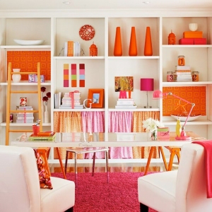
Unlike the last image, this design incorporates a few different colors such as bold oranges and fuschia pinks. These hues and vibrancy all lie next to each other on the color wheel (which I’ll get into more below) making the bright colors in this space interesting yet aesthetically pleasing to look at.
http://betterdecoratingbible.com/tag/color-blocking/
This last example (though quite a bit more eccentric than the last two rooms) has a broad range of color mixes such as bright greens, purples, and oranges. I’m sure the thought of putting these three colors together in a room would make most think “are you nuts?!” but after looking at how they actually complement one another, it’s not so crazy after all! This color scheme would be referred to as a Triad Complementary Color Scheme meaning an equilateral triangle on the color wheel where three colors comprised of a triad scheme are spaced out equally and are then balanced equally.
 http://www.okwall.com/wallpaper/19439-split-analogous-color-scheme.html
The first principle rule learned in interior styling is the color wheel as you can see above. You can visually see which colors work best with one another but the possibilities are endless once you get the hang of it!
To conclude my first blog ever (eek!), I’ll end it on this note:
Keep it classy,
Steph


